Case Study - Bensons for Beds / Mammoth
A wellbeing sub-brand for the nation's biggest bed retailer.
Mammoth's sleep technology needed a consumer-facing identity that could live inside Bensons for Beds stores nationwide, sell the health story, and stretch to a range built specifically for children.
The challenge
Selling sleep technology on a showroom floor.
Mammoth's sleep technology is scientifically tested and proven to improve sleep and wellbeing, but that story gets lost fast in a bed showroom where every mattress claims to be comfortable. Bensons needed a sub-brand that could stop shoppers at the point of decision and explain, in seconds, why bhealthy was different.
It also needed to work as a family proposition, with a range built specifically for children's health and sleep, not just an adult product with a smaller price tag.
The approach
A wellbeing identity that works from the shop floor to the bedroom.
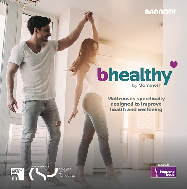
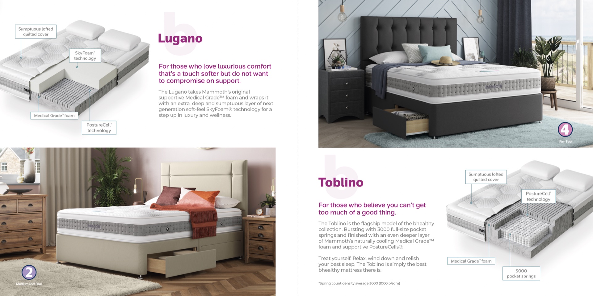
We built bhealthy as a distinct sub-brand under the Mammoth name, with its own mark, colour system, and tone, designed to sit clearly alongside the wider Bensons range while carrying its own health-led story. Brochures, in-store marketing, and campaign creative all led with the sleep science, not just the product.
The bhealthy Kids range extended the same system into a dedicated children's brochure and packaging, built to reassure parents rather than compete for attention with the adult range.
Delivered
- Sub-brand identity system
- Retail marketing and in-store creative
- Consumer brochure
- Kids' range brochure and packaging
- Campaign photography direction
The result
Outcome