Case Study - Rimondi Grand Resort & Spa
A luxury Crete resort, branded for an international audience.
A four-star resort and residential development on Crete needed a brand mark and print system elegant enough to sit alongside the world's established luxury resorts, and flexible enough to sell both holidays and property.
The challenge
Luxury has to be earned in the details.
Rimondi Grand is a four-star resort and residential development in Crete, part of the Interval International network and selling to an international audience of holidaymakers and property buyers. In a category where every competitor claims luxury, the brand had to prove it through restraint: considered typography, a refined mark, and print collateral that felt as premium as the setting.
It also had to work across two audiences at once, guests booking a stay and buyers considering a property, without feeling like two different brands.
The approach
A mark built to last, and collateral built to sell two ways.
We developed the Rimondi Grand identity around an ornamental crest mark, paired with an olive-and-stone colour palette drawn from the Cretan landscape itself, so the brand felt rooted in place rather than generic luxury.
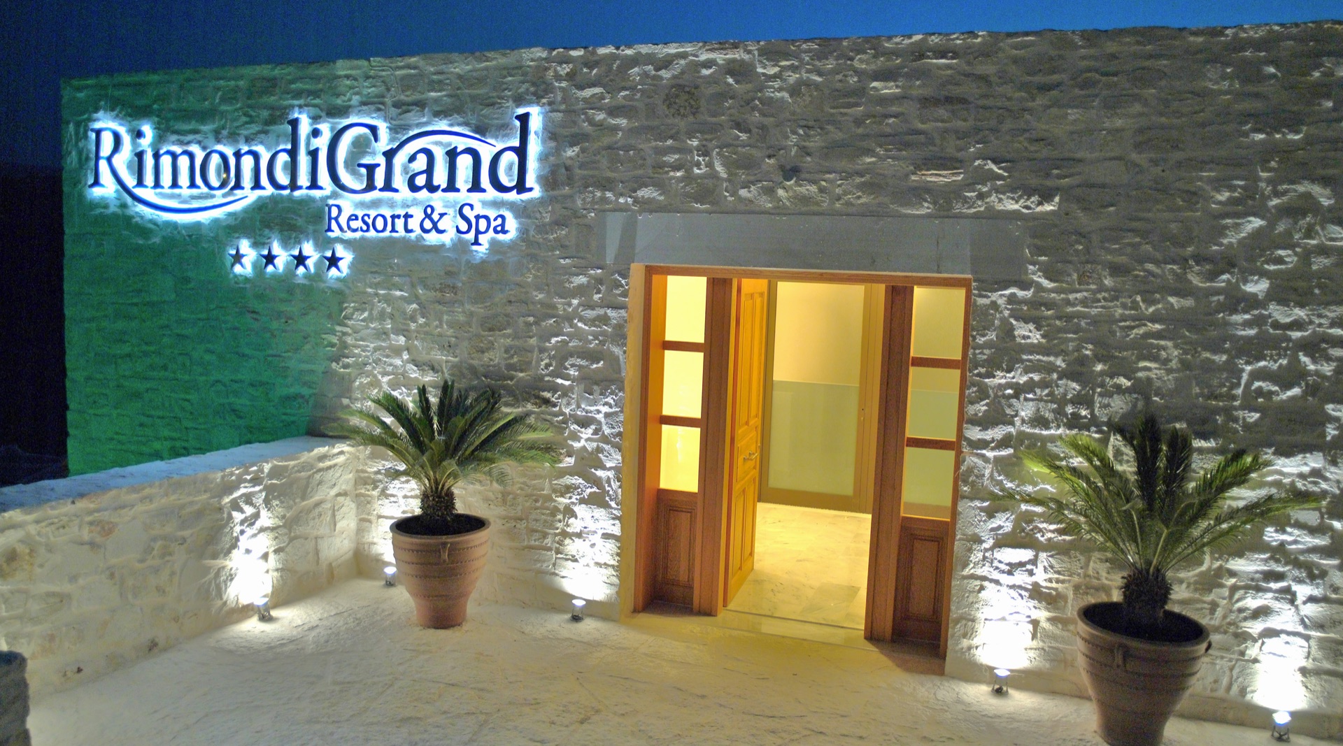
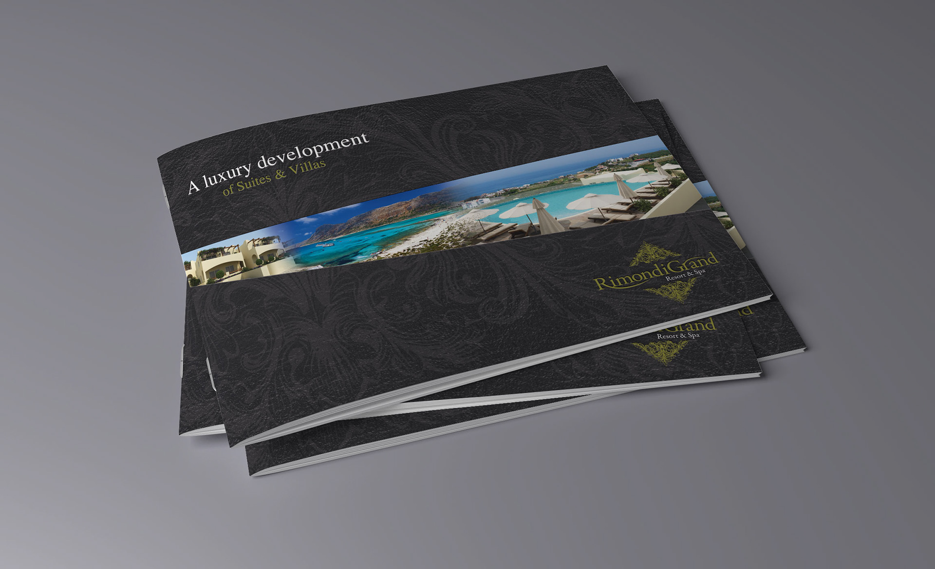
From there we built the full print system: a luxury development brochure, a consumer brochure, stationery, and signage, all designed to carry the same restrained confidence whether the reader was booking a week's stay or considering a purchase.
Delivered
- Brand identity and crest mark
- Luxury development brochure
- Consumer brochure
- Stationery system
- Signage and print collateral
The result
Outcome