Case Study - Mammoth Group
A visual identity built to hold a growing brand family together.
Mammoth's sleep technology sits behind mattresses sold under its own name and under retail sub-brands like bhealthy. The identity had to be disciplined enough to anchor all of them.
The challenge
One identity, built to stretch across a growing brand family.
Mammoth's sleep technology underpins its own mattress range and a growing set of retail sub-brands, each with a different audience and a different retail environment. Without a disciplined core identity, every new sub-brand risks drifting further from the parent company that actually engineered the product.
The brief was to build a visual identity flexible enough for that family of brands, but distinctive enough that Mammoth's own name still meant something on its own.
The approach
A system built on a mark, a palette, and a pattern.
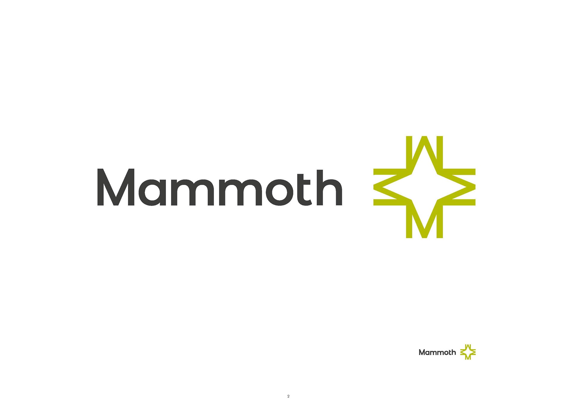
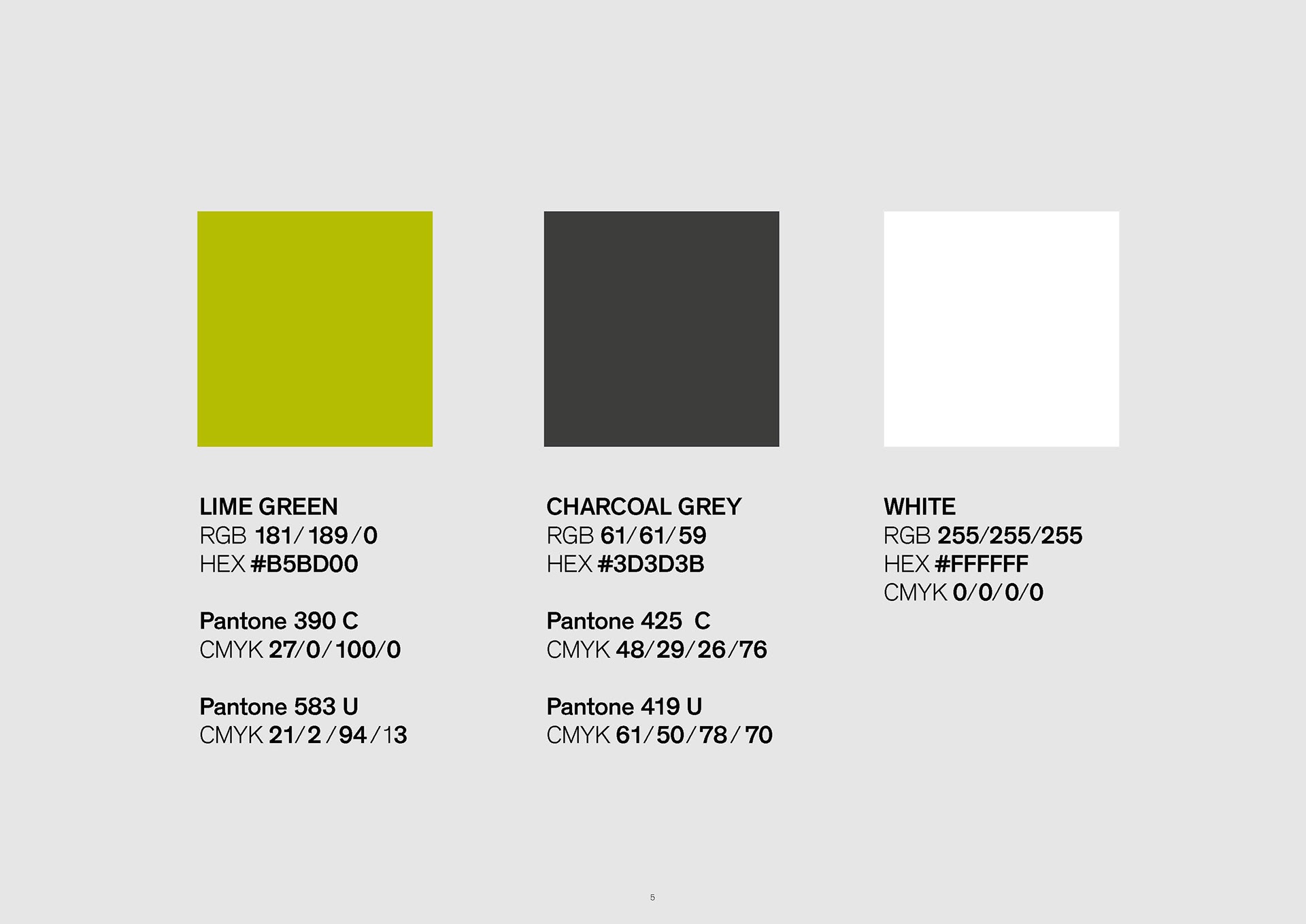
We built the Mammoth identity around a geometric compass-star mark, a lime green and charcoal palette, and a Montserrat-based type system, documented as a full brand deck so the mark could be applied consistently across packaging, retail, and marketing.
A generated pattern derived from the mark itself gives the brand a distinctive surface texture that can carry across packaging and environments without needing photography every time.

Delivered
- Visual identity system
- Full brand deck
- Brand structures guidelines
- Logo usage guide
- Consumer brochure
The result
Outcome