Selected work - HIGGYS
A clearer way to talk about better sleep.
From the wordmark to the shop floor. A confident identity and a connected set of tools for a mattress brand built around materials, support and the Recovery Standard.

Built around the Recovery Standard.
The brief
Make the difference visible.
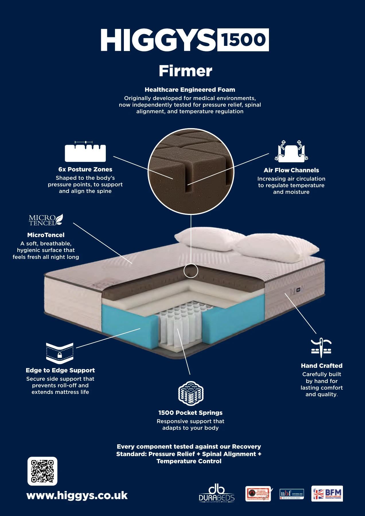
HIGGYS needed to explain what sits inside its mattresses and give retailers a clear way to tell that story. The work had to connect the brand, its product range and the experience of discovering it online or in a showroom.
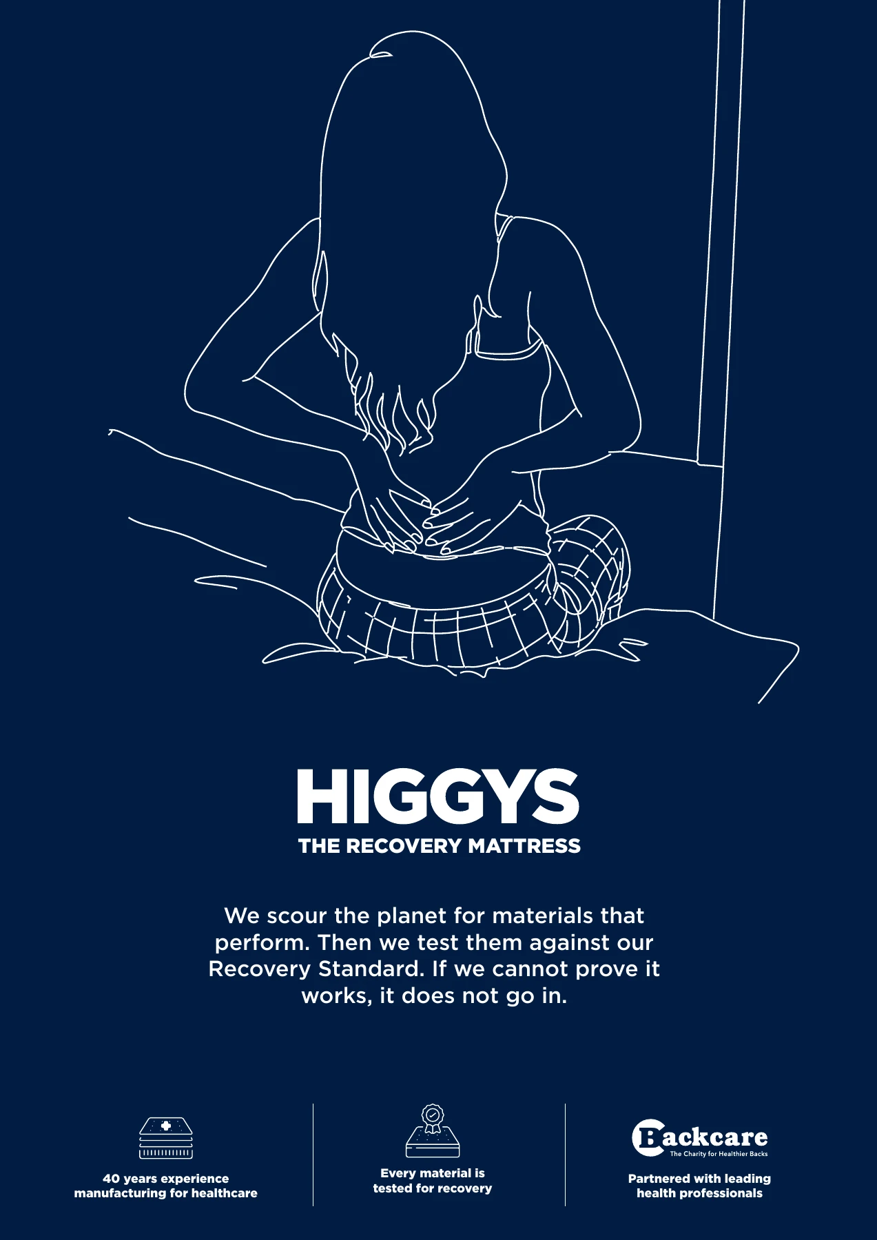
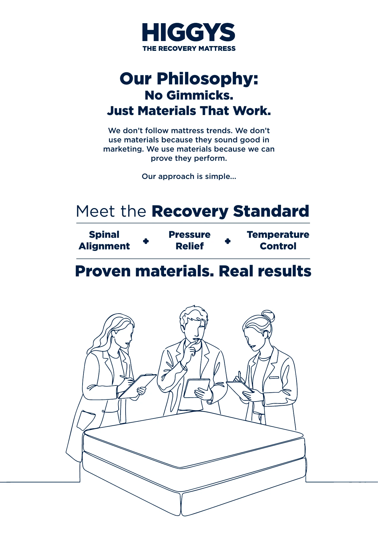
The Recovery Standard gave the communications a shared structure: spinal alignment, pressure relief and temperature control. Our role was to make that thinking easier to recognise and navigate across the brand.
A confident wordmark. A focused visual language.
01 / Identity
A brand with the confidence to be simple.
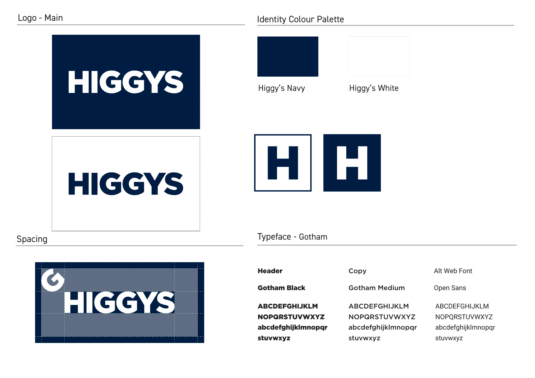
A bold wordmark, a compact H monogram and a disciplined navy and white palette give the brand a consistent starting point. Product diagrams and line illustrations do the explaining, with a clear hierarchy between the brand, the range and the material story.
02 / In application
The same story, from showroom to screen.
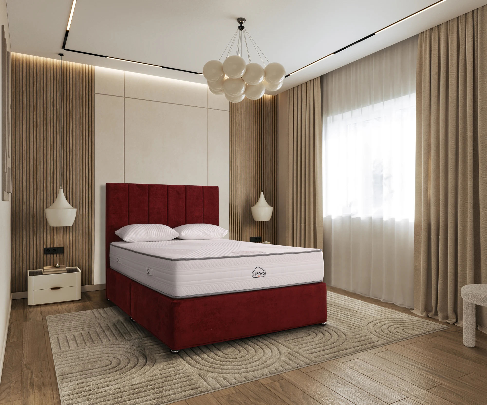
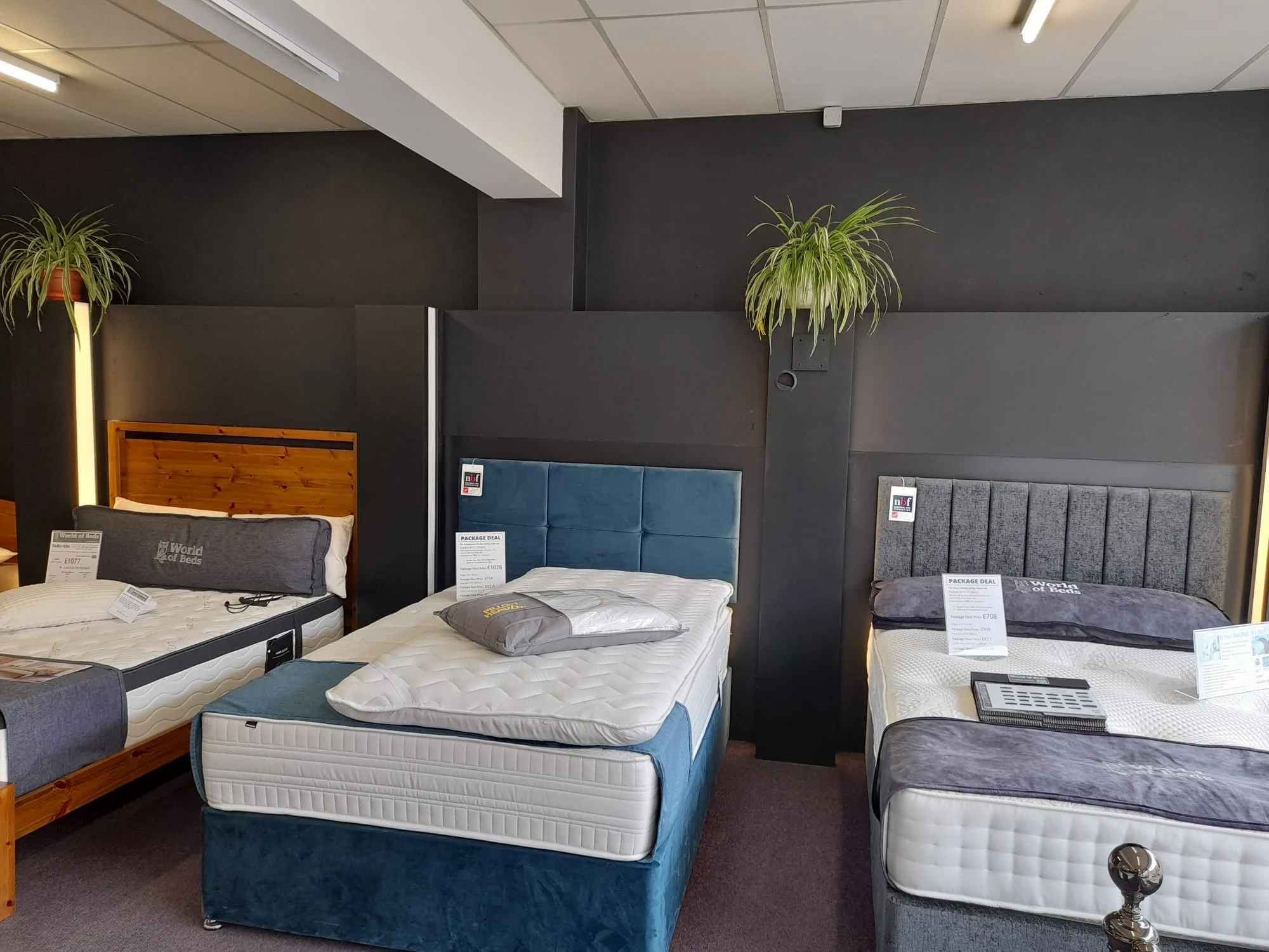
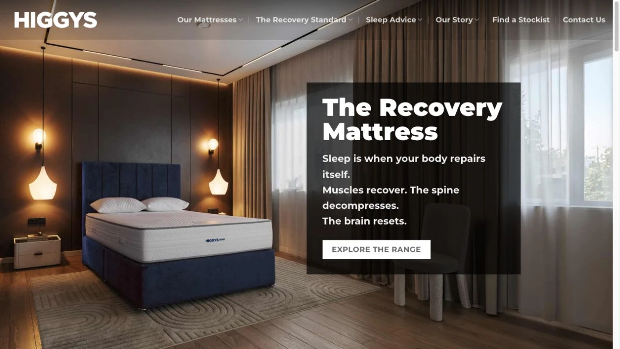
The system extends into product imagery, retail point of sale, sales and training packs, social assets and the website. Each application helps customers and retail teams move from an overall promise to the detail of the range.
Let’s make your next chapter visible