Selected work - Happiest at Home
A more human face for care and support.
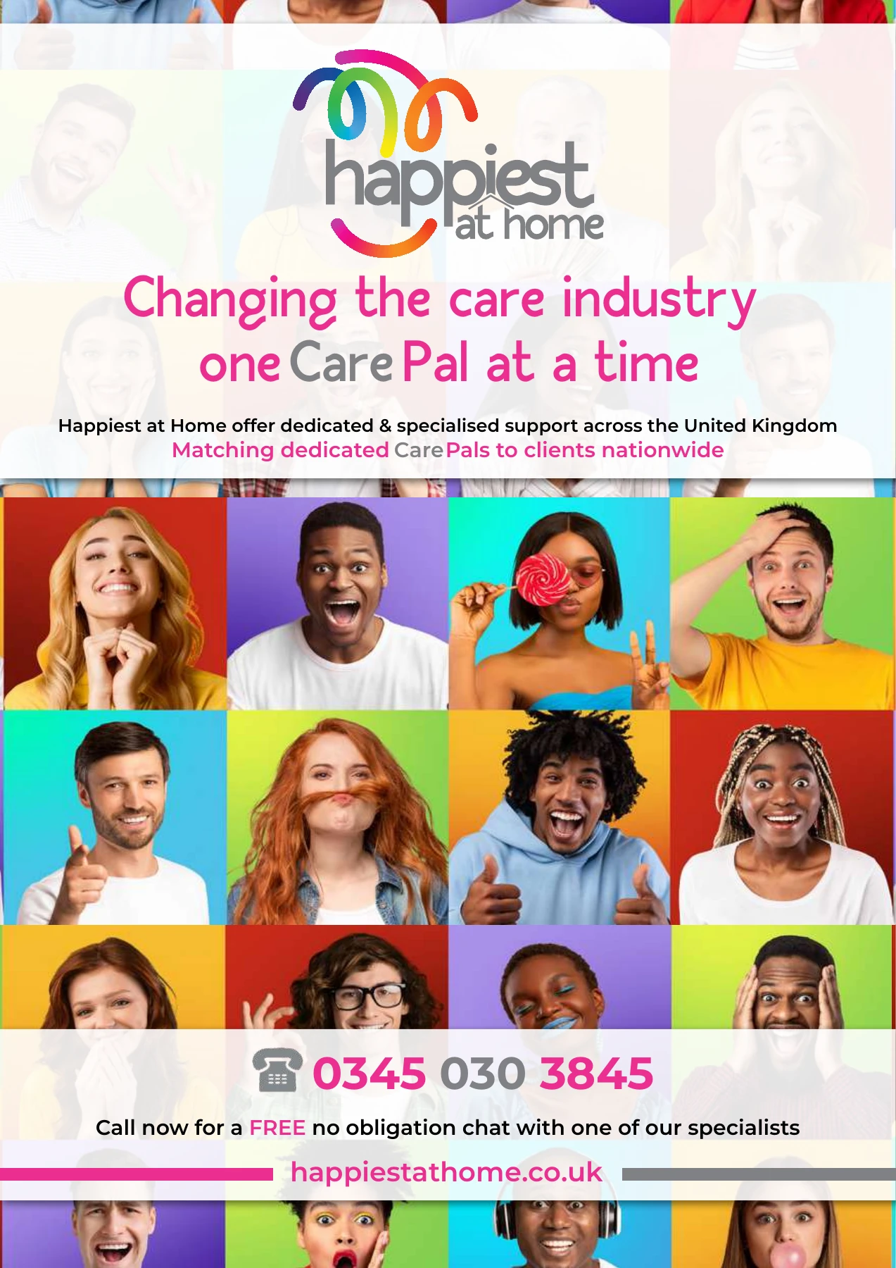
A warm, distinctive identity and a clearer digital journey, built around the relationship between a person and their CarePal.
Care, with a familiar face.
The brief
Put the relationship at the centre.
Happiest at Home’s proposition is care and support from someone you know and choose. The brand and website need to make that personal relationship easy to understand, while giving clients, families and professional referrers clear routes to information.
The work connects positioning, visual identity, website and communications around the CarePal concept. The emphasis is on a familiar person, continuity and a more approachable experience.
Warmth, recognition and a smile.
01 / Identity
Personality with a practical purpose.
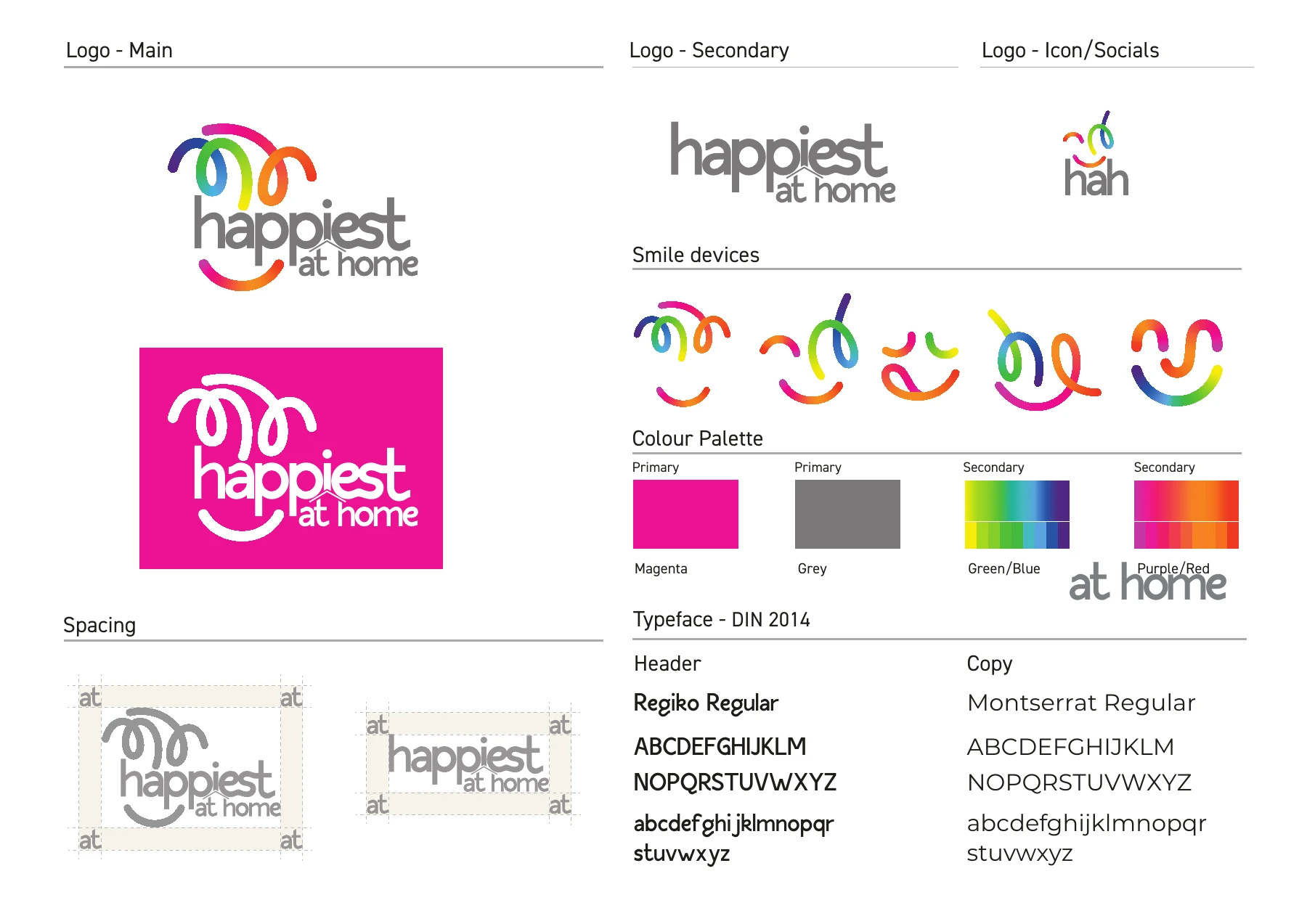
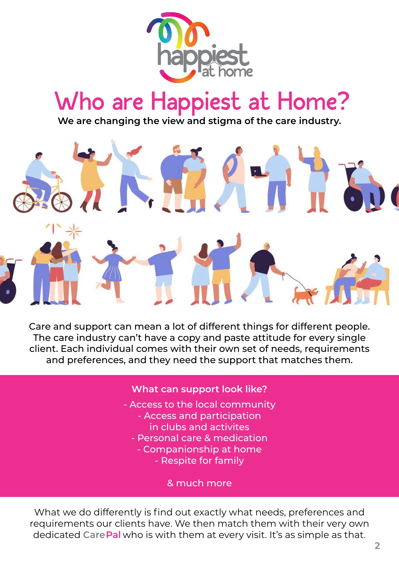
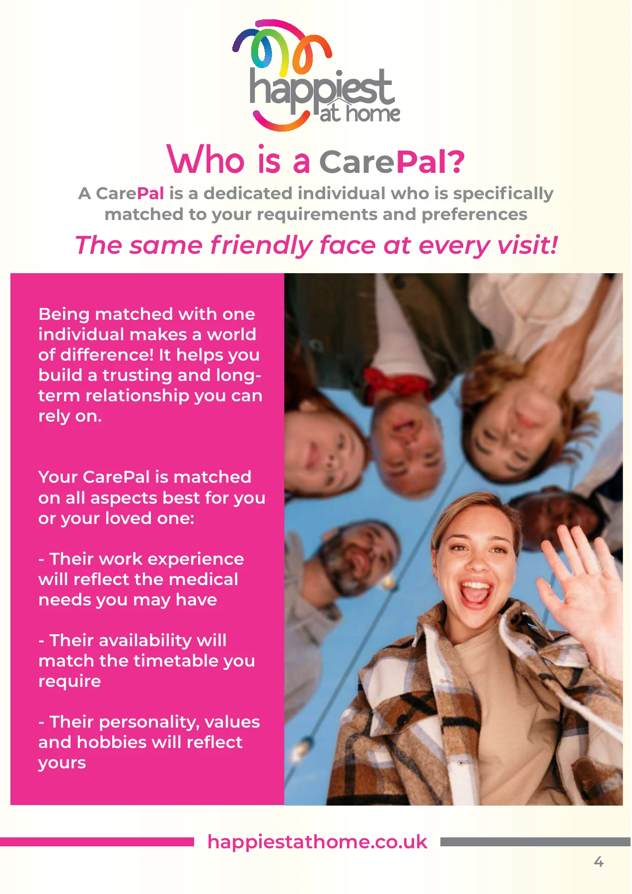
The colourful smile devices give the identity a human quality and a flexible graphic language. A recognisable logo and bright magenta anchor the system across everyday communications.
02 / Digital
Make the next step feel straightforward.
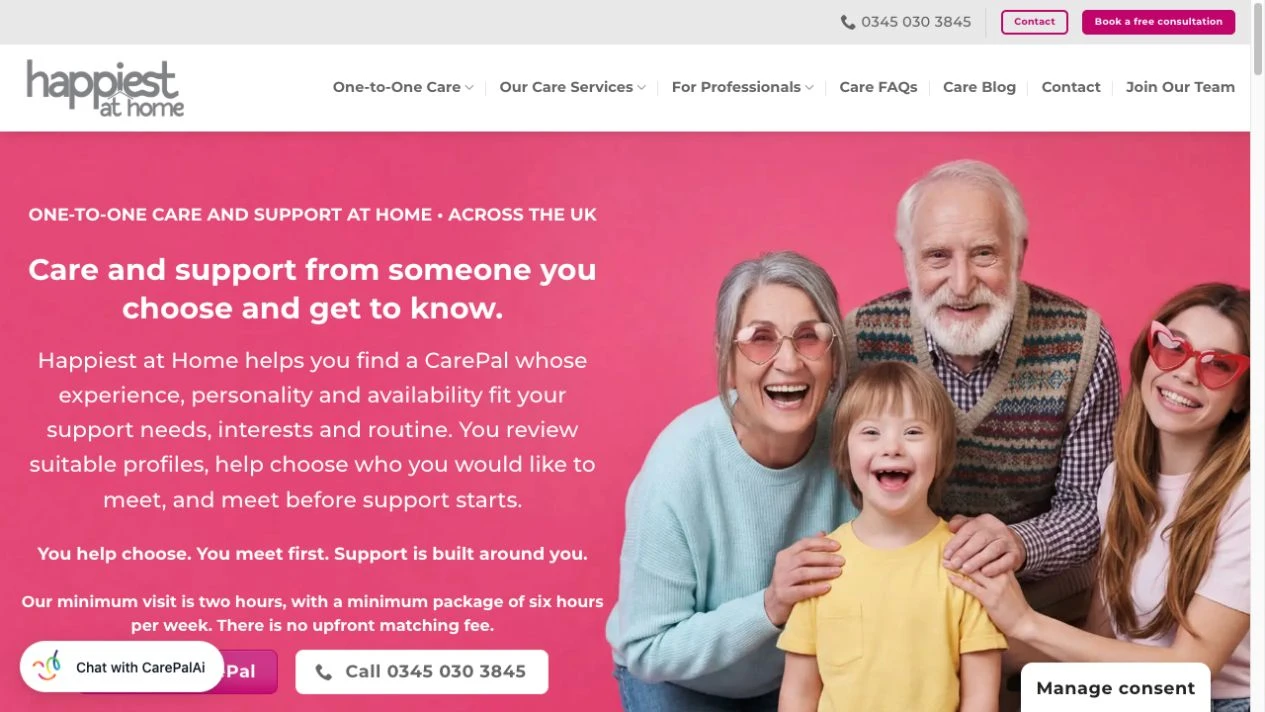
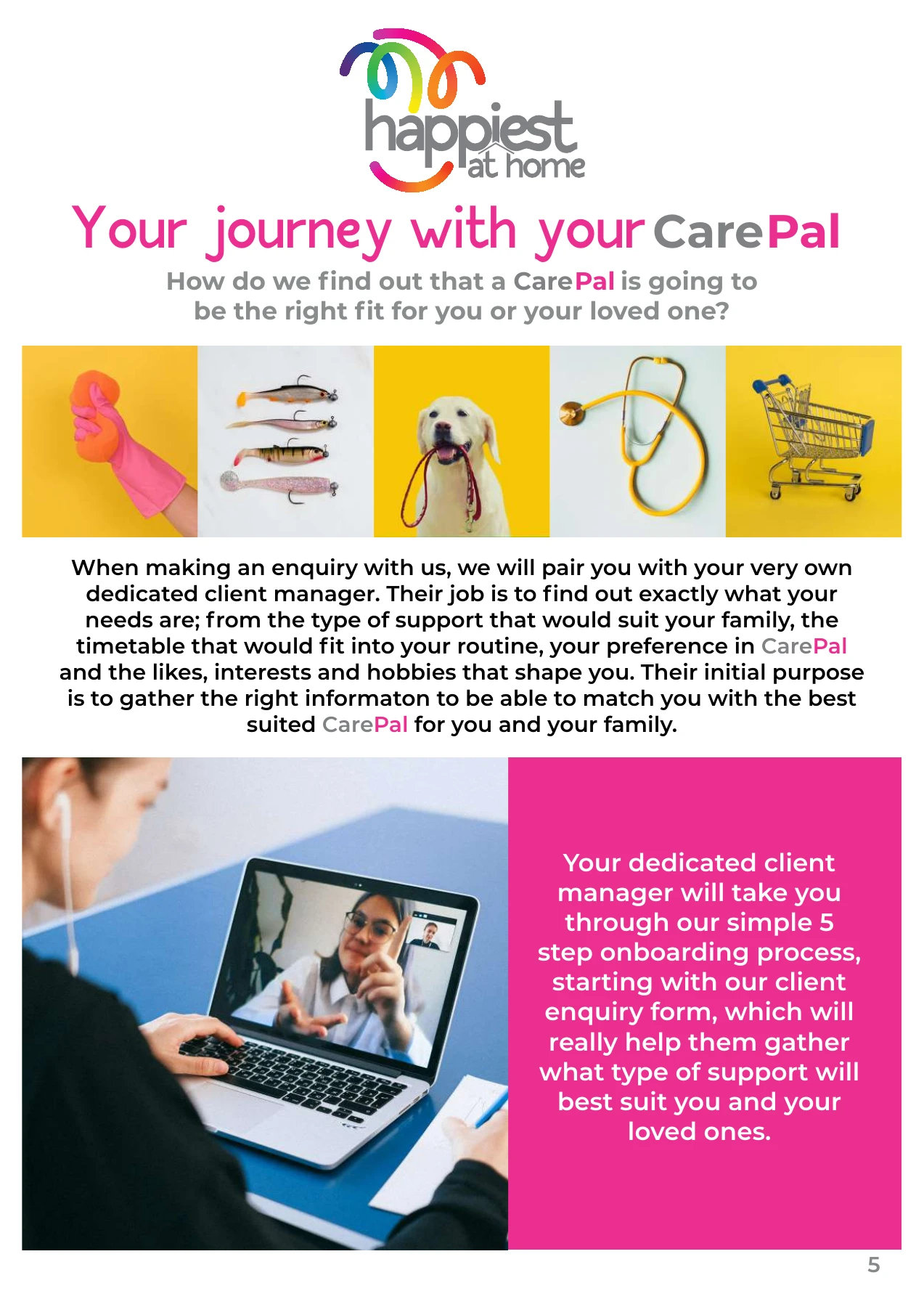
The website brings the CarePal proposition, service information and enquiry journey into one coherent experience. Clear navigation and direct language help visitors find the information relevant to them.
The broader work also includes communication planning and enquiry workflows, connecting how the brand is presented with how a conversation begins.
Let’s make your next chapter visible